· Petr Korab · Networks · 6 min read
Text Network Analysis: Generate Beautiful Network Visualisations
Discover how to visualize text networks in the circular, radial, and matrix forms: circos, hive, and matrix plots. At the same time, learn the dos and don’ts of plotting text networks.
Discover how to visualize text networks in the circular, radial, and matrix forms: circos, hive, and matrix plots. At the same time, learn the dos and don’ts of plotting text networks.
Introduction
This article develops a series on text network analysis in Python. It builds on Text Network Analysis: Theory and Practice, laying down the fundamentals of text networks, and Text Network Analysis: A Concise Review of Network Construction Methods, focusing on data preparation and network construction strategies.
The last article split the strategies for constructing a text network into (i) net is drawn from the raw text, and (ii) the net is built on the pre-processed data with the edges and nodes clearly defined. In this article, we will expand the second option and use the pre-processed classic IMDb 50K Movie Reviews (see the data license) to illustrate the following network graphics:
- circos plot: to visualize a network in a circular layout
- hive plot: to structure the network graph along several axes
- matrix plot: to plot a net in its matrix form.
We will not cover the standard network diagram but rather focus on more advanced plots. Pyvis is a very handy Python library that enables the interactive configuration of graphic widgets and can be effectively used here. This tutorial by Khuyen Tran provides an excellent introduction. Also, arc plot, which forms the basis of circos, can intuitively be developed on text networks.
Best practices for text network visualization
#1: Start with a goal
Network data structures can be very complex. To make the visualization job successful, figure out clearly at the beginning (1) the story you want to tell with the graphics and (2) which relationships you want to highlight.
#2: Avoid the “hairballs”
“The purpose of visualization is insight, not picture.” — Ben Shneiderman
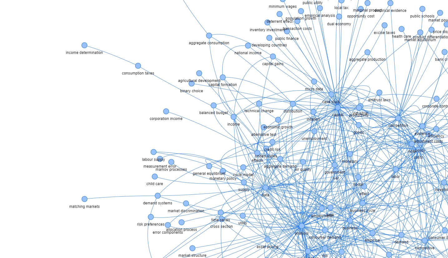
A “hairball” is a term that refers to a graph showing connections that are so dense that they can’t be usefully visualized. We might get to a situation where we plot a chart with a significant number of nodes (one rule of thumb being 30 nodes or more, as Ma (2022) suggests), where the visualization results in a hairball mess.
Possible solutions include:
- Sort nodes: reduce the number of nodes to the most significant ones (e.g., only those with edges over a certain weight)
- Group nodes: pre-process the data differently, group the nodes into specific categories
- Select suitable graphics: some plots, such as circos plot, can better display data with many nodes
- Adjust the graph properties: image size, etc.
#3: Prioritize significant edges
In many cases, we are more interested in specific nodes, and corresponding edges, than the rest of the data. Let’s give them a priority, increase the width of the edge line, or use a specific color to distinguish them, if this makes sense for your data story.
“The heart of a graph lies in its edges, not in its nodes.” — John Quackenbush
Example:
“With the COVID-19 virus spreading, contact tracing has become quite important. In an infectious disease contact network, where individuals are nodes and contact between individuals of some kind are the edges, an ‘important’ node in this contact network would be an individual who was infected and who also was in contact with many people during the time that they were infected.” (Ma and Seth, 2022)
#4: Node positioning and coloring make a difference
Correct positioning and coloring of nodes in the graph might improve the graph’s informative value while keeping the data structure unchanged.
To be most informative and communicative, a graph visualization should first prioritize node placement in a fashion that makes sense. (Ma and Seth, 2022).
Sorting nodes, placing movie titles and features on the opposite sides of the plot, and coloring the groups of nodes can improve understanding even of small networks.
Circos plot — from network to a circle
A circos plot, or more generally, a chord diagram, displays the network in a circular shape. The edges in a circos plot are typically drawn as arcs, and their size is proportional to the importance of the connection.
Krzywinski et al. (2009) originally developed the idea of displaying relations in a circular layout for visualizing genomic data, and it soon took root in other areas, such as labor economics and applied machine learning.
There is a large variety of tools and libraries that implement a Circos-like type of graph. In Python, they are Nxviz, Circos, PCircos, or pyCircos.
Hive plot — from network to a coordinate system
A hive plot is a network visualization method where nodes are placed on radially oriented linear axes. Nodes are assigned to one of two (or more) axes, which may be divided into segments. Edges are drawn as curves, which can be annotated with color, thickness, or labels.
Hive plot benefits:
- Inter-group and intra-group connection visualization
- Direct network visual comparability
Research question: Which movie studios are predominantly compared by reviewers in movie reviews?
The data is transformed into nodes and edges that reflect the co-occurrence of movie names in the reviews. Each row in the data indicates how frequently these nodes appeared jointly in a single review.
Implementation
Python offers several libraries for hive plots. The most common are Nxviz and Hiveplotlib. Nxviz provides efficient plotting while Hiveplotlib supports more complex customization.
# Import necessary packages

# Load data on nodes, edges, and attributes

# Create graph G and assign attributes

# Plot hive diagram
From a simple example, we might observe more inter-group connections between Marvel and Lucasfilm movies than intra-group links.
Matrix plot — from network to a matrix
A matrix plot displays a network in matrix form. Nodes are on both the x- and y-axes, and a filled cell represents an edge between them.
Matrix plots help determine if a graph is directed or undirected.
“Imagine graphs as a set of pumps that can send liquid to others when they are connected. In directed graphs, the arrow shows where it comes and where the liquid goes; in the undirected graph, it goes from both ways.” — Stack Overflow
Example:
In flight network data:
- If Heathrow to CDG and CDG to Heathrow exist, the plot is symmetric (undirected)
- If only Heathrow to CDG exists, the plot is asymmetric (directed)
Conclusion
Most of this article generally refers to network visualization and requires text data to be transformed into edges and nodes. In text data, the nodes are semantic concepts, keywords, topic groups, or other entities with string types.
To draw a network from raw text like reviews or articles, use a tool that implements a community detection algorithm, such as Infranodus or Textnets.
A Jupyter notebook with the code for this tutorial is available here.
Petr Korab is a Python Engineer and Founder of Text Mining Stories with over eight years of experience in Business Intelligence and NLP.